
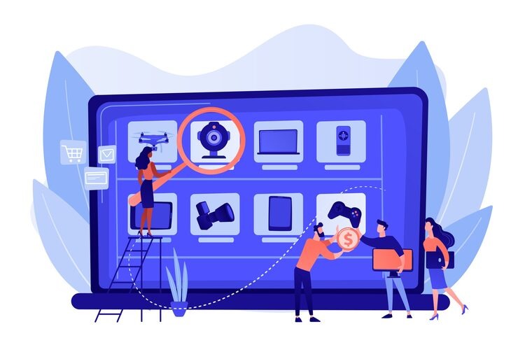
Running a Shopify store is exciting. You get to create, customize, and sell to customers all over the world. But the excitement quickly fades when things stop working. Themes break, layouts look messy, or mobile users complain about poor performance. Since more than 70 percent of online shoppers now browse from their phones, fixing theme and mobile responsiveness issues has become critical for every store owner. If your site is hard to use, you will lose sales.
The good news is that most Shopify issues are fixable. With the right approach, you can spot the problem, apply quick solutions, and know when to call in expert help. Let’s break down the most common Shopify theme and mobile issues, why they happen, and how to solve them.

Migrating Custom Code Between Theme Versions
Updating a Shopify theme is often necessary. New versions come with design improvements, performance upgrades, and better features. But one thing doesn’t automatically move with an update: your custom code. If you’ve spent hours adding unique filters, building custom layouts, or tailoring scripts, those edits can vanish as soon as you switch to a new theme version.
This can be frustrating, but the process of carrying over your code is manageable if you plan ahead. Always start by backing up your current theme. Having a duplicate copy ensures that even if something goes wrong, you won’t lose your original setup. Once you’ve done that, compare your old theme with the new one side by side. This allows you to see exactly what has changed. From there, reapply your custom code snippets into the correct Liquid files.
If you want to be extra careful, track your changes through GitHub or Shopify’s code editor. This gives you a clear record of edits and makes it easier to identify issues later. Still not sure? With Our Shopify Services you can let us worry about the issues while you focus on the sales.
Here’s a checklist before updating your theme:
- Duplicate your current theme for safety
- Copy all custom code into a separate file
- Test the new version in preview mode
- Publish only when everything works smoothly
Consider this example: a store lost all its custom product filters after a theme update. Because they had a backup, those filters were restored in under two hours. Without that duplicate, the recovery process would have taken days. Preparation is what saves you from downtime.
Customizing Shopify 2.0 Sections Everywhere
Shopify 2.0 is powerful because it allows sections to be placed anywhere. This flexibility helps store owners create unique layouts and dynamic product pages. However, it also introduces room for error. If JSON templates aren’t structured properly, layouts can break. You may find that a section you added on desktop doesn’t appear on mobile, or it behaves strangely across devices.
The key here is to double-check your JSON template structure. Each block must be correctly placed under its schema tags. A small error in the template can cause entire sections to disappear. That’s why testing is so important. Never publish changes without previewing on both desktop and mobile.
Here’s a quick checklist to avoid issues:
- Validate your JSON syntax for errors
- Always keep a duplicate theme before editing
- Test across devices before making changes live
For example, a fashion brand added a “size chart” section on their product page. Everything looked fine on desktop, but the chart vanished when viewed on mobile. After checking the JSON schema, they realized a misplaced tag caused the problem. Fixing the structure restored the chart instantly. Small errors often lead to big frustrations, but they’re easy to correct once you know where to look.

Liquid File Conflicts After Theme Updates
Liquid files power Shopify themes, and when a theme update happens, conflicts between old and new code can appear. These usually show up as errors such as “undefined variable” or missing snippets.
If this happens, start by reviewing Shopify’s error logs. They will point you to the specific files causing the issue. Compare the old Liquid files with the new ones to see what has changed. Once identified, re-add the missing variables or snippets manually. Having a backup comes in handy here as well, since it gives you a reference for what the files looked like before the update.
Sometimes these conflicts are minor and can be fixed in minutes. Other times, they pile up and cause major site issues. If that happens, it’s often faster and safer to bring in a Shopify developer. A professional can resolve conflicts without risking further errors, saving your store from unnecessary downtime.
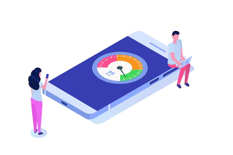
Poor Mobile Speed Scores
Mobile speed is one of the most important factors in keeping customers engaged. A slow store drives buyers away, no matter how great your products are. Unfortunately, third-party apps are often the biggest reason behind performance drops.
The first step is to audit all your installed apps. Identify the ones you no longer use and remove them. Next, optimize your images. Shopify has a built-in optimizer that helps compress and resize heavy visuals. Enabling lazy loading for videos and images can also make a huge difference, as it ensures that media only loads when a user scrolls down to view it. Mobile speed improvements directly support On-Page SEO optimization, helping products rank higher and convert more customers.
Here’s a quick breakdown of speed issues and their fixes:
| Problem | Quick Fix |
| Too many apps | Delete unused apps |
| Heavy images | Compress and resize |
| Slow scripts | Lazy load and defer |
| Poor hosting | Use Shopify CDN |
One real-world example is a skincare brand that lost nearly 40 percent of its mobile speed score after installing three separate review apps. By removing one of those apps and compressing their images, their score bounced back above 80. This simple change made their site faster and their customers happier.
The lesson here is clear: every app and image matters. A leaner, optimized store will always perform better than one bloated with unnecessary elements.
Sticky Headers or Menus Not Working on Mobile
Sticky headers and menus make navigation easier, especially for mobile users. But they often break due to CSS conflicts.
The fix usually involves checking z-index values and applying sticky classes specifically for mobile breakpoints. Using Chrome DevTools helps identify the issue quickly. After adjustments, always test across both iOS and Android devices.
If sticky elements continue to fail despite adjustments, the conflict is likely deeper and requires a more technical CSS solution. Leaving it broken hurts the user experience, so it’s better to resolve it early.
Blog Content Width Too Narrow for Readability
Not all problems are about products or speed. Sometimes, blog content itself becomes difficult to read. A narrow content area makes articles cramped, and on mobile, it feels even worse.
The solution is simple but effective. Increase your blog’s maximum width in theme settings or CSS. Aim for a max-width between 650 and 750 pixels. Use larger, mobile-friendly fonts—at least 16px—and keep paragraphs short. Breaking content into small chunks makes it easier for readers to scan and digest information.
Here’s a readability checklist to keep in mind:
- Max-width between 650 and 750px
- Paragraphs under three lines
- Font size of 16px or more
Making these small changes improves readability and encourages visitors to spend more time engaging with your content.
Make Your Shopify Store Flawless!
Shopify gives store owners the tools to build incredible businesses, but technical issues can appear at any stage. From migrating custom code to optimizing mobile speed, each challenge requires patience and careful attention. The key is preparation. Back up your work, test before publishing, and keep your store lean by removing unnecessary apps and files. If you still need help, Contact UnionLogix and we will be more than happy to offer our assistance.
Avoid long downtimes, keep your mobile experience smooth, and maintain a store that both looks and performs at its best. And when challenges go beyond your comfort zone, don’t hesitate to seek professional support. A well-optimized Shopify store is not just about good design—it’s the foundation of higher sales and happier customers.
FREQUENTLY ASKED QUESTIONS!
Why isn’t my Shopify theme responsive on mobile?
Usually, custom code, outdated apps, or oversized images break the theme’s mobile layout.
How can I quickly test mobile responsiveness for my Shopify site?
Use Shopify preview, Chrome DevTools, or Google’s Mobile-Friendly Test for quick checks.
Which Shopify themes are best for mobile responsiveness?
Shopify 2.0 themes like Dawn, Sense, and Craft are mobile-first and adjust automatically.
My images appear cropped or too large on mobile—what should I do?
Upload images in correct aspect ratios and choose “Adapt to Image” instead of “Fill.”
Buttons or text appear too small or hard to tap on mobile—how can I fix this?
Increase button padding and use at least 16px font size for easy tapping.
I’ve added custom code or apps—now my mobile layout is broken. What should I do?
Disable the code or app, test again, and re-add carefully or contact support.
How do media queries help with mobile layout fixes?
They let your store adjust styles for different screen sizes like phones and tablets.
My mobile site loads slowly. What optimizations should I prioritize?
Compress images, remove unused apps, enable lazy loading, and reduce heavy scripts.
What are best practices for mobile-friendly content on Shopify?
Keep paragraphs short, use larger fonts, clear headings, and thumb-friendly buttons.
Do I still need to test my mobile site regularly?
Yes, test monthly on both iOS and Android since themes and apps keep updating.
I’m using the Dawn template and still seeing cutoff images—what’s wrong?
Upload images in the recommended size and use mobile-specific banners when needed.


